M3
After "finishing" my webpage i was looking through it and realized that i did not have a submit button on my front page so after people put there log in details they would not be able to submit there details and log in so i decided to add a small submit button so they would be able to log in
After "finishing" my webpage i was looking through it and realized that i did not have a submit button on my front page so after people put there log in details they would not be able to submit there details and log in so i decided to add a small submit button so they would be able to log in


i wanted to make it look nice and match the page so it would not look out of place and i played around with different fonts sizes and colors but in the end i added a button from Dreamweaver and thought although it does not match my initial designs for the page i thought it looked nice and clean and it made it very obvious how to log into the page so that is what i settled on
The screenshots are taken from my work in dream weather before and after i added the button
I also wanted to make my home page look cleaner and make it look appealing and closer to my orrigional plan so i added a blue border around the log in section i believe this makes it easier to see and makes the text fields easier to read
 i think that is is a nice change i believe that the page looks much better because of this change
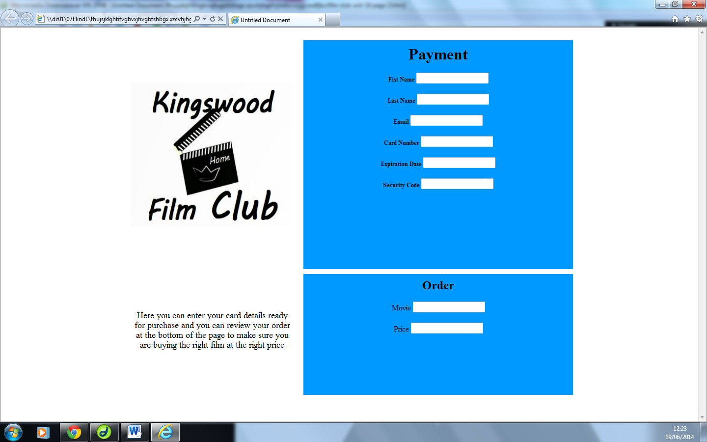
and the final change i have done to my website is i have taken the border away and put the cellpad and cellspace to 10 this makes it so you cannot see the border and there is a space between all of the fields and sections in the table i think this is the change i like the most because it makes the website look so much better and it was a very simple but effective change
The screenshots are taken from my work in dream weather before and after i added the button
I also wanted to make my home page look cleaner and make it look appealing and closer to my orrigional plan so i added a blue border around the log in section i believe this makes it easier to see and makes the text fields easier to read
and the final change i have done to my website is i have taken the border away and put the cellpad and cellspace to 10 this makes it so you cannot see the border and there is a space between all of the fields and sections in the table i think this is the change i like the most because it makes the website look so much better and it was a very simple but effective change